Thursday, 11 February 2016

The conventions- Puffs.


The puff in my magazine will say how free posters of the popular pop artists/bands will be included in my magazine,doing this will make people want to purchase the magazine over others because in this one you get free posters of people's favourite pop artists. This is often used in my style models so that it where I got my inspiration from. This text will be placed at the bottom of my magazine just under the central image.

Here is my style model showing how posters will be included:

The conventions- The title of my music magazine.


I have decided my music magazine will be called 'LISTEN' I have chose this because it clearly shows that my magazine is a music magazine because you listen. to music.My title will be placed at the very top of my front cover,just like it is on my style models,the title will be in bold text so it will stand out.

Here is my style model, they always have their title placed at the top in a bold text:


The conventions- The main image.

The main image of a front cover magazine is a very important image,this is one of the first things a person will see when choosing whether or not they would like to purchase my music magazine. The main image I have chosen is this one:
I think this image is a great choice for my front cover main image,the way Holly is looking at the camera makes her look professional and serious and this is what I want my magazine front cover to look like. I will be taking out the background of this picture and adding colour.

Friday, 5 February 2016

The conventions- The slogan.

Most magazines have slogans somewhere on the front cover. Slogans are normally a short snappy sentence that attracts readers and tries to persuade them that this magazine is better than any other magazine so they should but this one. After thinking about weather i want to include a slogan or not i have decided that i will be including one. The slogan that will be featured on my front cover will be 'The UK's Top Pop Fix', i have chose this because i think it flows well and clearly shows that my magazine will be featuring all pop artist.


The conventions- price.

As i have previously stated the social status of my target audience will be teens and because of this my music magazine will be priced at £2.50, this price is affordable for teenagers to be able to pay for a magazine, its not too high priced and it is also not too low priced because pricing things low can give it an image of being bad quality. This is also the normal price for a magazine like this such as 'We love pop' and i think this is an affordable price for teenagers to be able to buy my magazine at. The price of my magazine will be placed just under the title of my music magazine,I have chose to put it here because it will stand out and it is also where my style models place their price.


Monday, 25 January 2016

Best selection for the Contents page of my Music Magazine

Here are the pictures I will be choosing from to use for my contents page.


Although these pictures are quite different to each other I feel like they would both work for my contents page. These are the types of poses that would appear in my style models. One shows a lot of attitude while the other shows a more serious side of the artist,this is what I will have to think about when it comes to picking just one picture for my contents page.

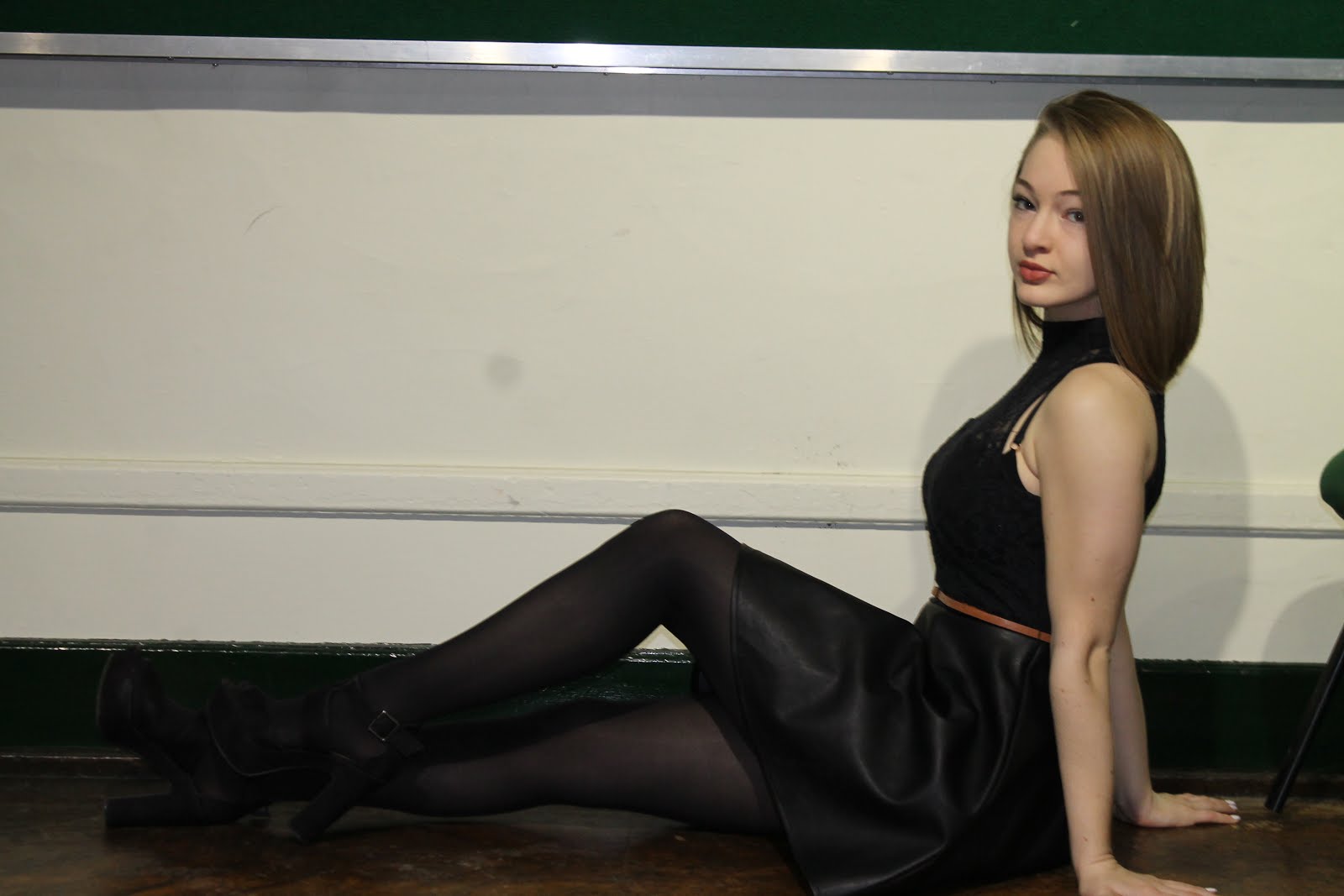
Best selection for the double page spread of my Music Magazine

Here are some pictures which have been taken out and chosen as my best ones for my contents page. I will be choosing out of these two for which one I will be using.


Two of these pictures are very similar and Holly is doing the same type of pose in both of them. However on one picture you can see more of Holly and the way she is posing whereas on the other one it is more zoomed in. In the third picture this picture will show that this magazine will be revelling things about the artist. These are all the type of poses my style models pictures include so this is where I got my reason for doing this,I feel like because the way Holly is positioned this would be good for my double page spread because the picture will run on to the second and not just be on the first. I will be choosing which one I like best and using it as my double page spread picture.