Showing posts with label Research & Planing. Show all posts

Friday, 29 April 2016

Front cover creation

When i started my front cover the first thing i done when take the background out of my chosen main image. I done this so later on i can add a colour to the background of my front cover and have the image blend well with it. This is the image before and after i took the original background out. Now it was ready for me to put it onto my front cover.


I then chose the background of my front cover. I wanted a colour that stood out so i chose a light blue. I then added my background colour to start my front cover. Then i added my image on top of the background colour, i think this image blends well with the colour i chose.


Then i moved on to the title of my magazine. As i have previously said the title of my magazine will be 'listen'. My title will be placed at the top of the front cover so it can stand out and catch peoples eye. I chose the colour black for my title and added a purple glow around it.

To add affect to the title i added a 'drop shadow' from the blending options. Doing this changed it form plain black and added a purple glow around each letter.  Heres the plain black compared to it with the drop shadow and purple glow.


I then added my slogan which is ' The UK'S Top Pop Fix'. I added this under the title of my magazine in a smaller sized text. Then i added a drop shadow affect to make the text darker and bolder.


Next i added the main text of the front cover which was 'Holly Hulse Reveals all'. When i added the text i wanted it to be black like the title. However as you can see you can't see the black text doesn't show up against Holly's black dress. so to fix this i added the drop shadow, outer glow, inner glow blending options to it and it made the text stand out over the black dress. 


When adding the banner at the bottom of my magazine i added a shape and added colour.


I then added the text 'free posters in every issue...' then i added some of the posters that will be included in my magazine, lastly i added the barcode because i wanted it to be at the bottom of my magazine just like my style model.


Then to show what is going to be featured in the magazine i added lines so i could then text inside them. I done the lines the purple colour so it matches the rest of my colour scheme. Here is what the lines on their own looked like.


Then i added the text in between the lines. I had a main title for each but of text which was the artist names, then i added a little more detail underneath.


Lastly i added the price of the magazine. I placed this underneath the slogan so people can see it, i put a purple coloured shape around it to make it stand out.


Thursday, 21 April 2016

Assessing My Coursework


Here is my front cover compared to a level 3 front cover, i think these two have some things in common like they both have a banner going across the bottom. Also they both have slogans featured. 


Thursday, 11 February 2016

The conventions- Puffs.


The puff in my magazine will say how free posters of the popular pop artists/bands will be included in my magazine,doing this will make people want to purchase the magazine over others because in this one you get free posters of people's favourite pop artists. This is often used in my style models so that it where I got my inspiration from. This text will be placed at the bottom of my magazine just under the central image.

Here is my style model showing how posters will be included:

The conventions- The title of my music magazine.


I have decided my music magazine will be called 'LISTEN' I have chose this because it clearly shows that my magazine is a music magazine because you listen. to music.My title will be placed at the very top of my front cover,just like it is on my style models,the title will be in bold text so it will stand out.

Here is my style model, they always have their title placed at the top in a bold text:


The conventions- The main image.

The main image of a front cover magazine is a very important image,this is one of the first things a person will see when choosing whether or not they would like to purchase my music magazine. The main image I have chosen is this one:
I think this image is a great choice for my front cover main image,the way Holly is looking at the camera makes her look professional and serious and this is what I want my magazine front cover to look like. I will be taking out the background of this picture and adding colour.

Friday, 5 February 2016

The conventions- The slogan.

Most magazines have slogans somewhere on the front cover. Slogans are normally a short snappy sentence that attracts readers and tries to persuade them that this magazine is better than any other magazine so they should but this one. After thinking about weather i want to include a slogan or not i have decided that i will be including one. The slogan that will be featured on my front cover will be 'The UK's Top Pop Fix', i have chose this because i think it flows well and clearly shows that my magazine will be featuring all pop artist.


The conventions- price.

As i have previously stated the social status of my target audience will be teens and because of this my music magazine will be priced at £2.50, this price is affordable for teenagers to be able to pay for a magazine, its not too high priced and it is also not too low priced because pricing things low can give it an image of being bad quality. This is also the normal price for a magazine like this such as 'We love pop' and i think this is an affordable price for teenagers to be able to buy my magazine at. The price of my magazine will be placed just under the title of my music magazine,I have chose to put it here because it will stand out and it is also where my style models place their price.


Monday, 25 January 2016

Best selection for the Contents page of my Music Magazine

Here are the pictures I will be choosing from to use for my contents page.


Although these pictures are quite different to each other I feel like they would both work for my contents page. These are the types of poses that would appear in my style models. One shows a lot of attitude while the other shows a more serious side of the artist,this is what I will have to think about when it comes to picking just one picture for my contents page.

Best selection for the double page spread of my Music Magazine

Here are some pictures which have been taken out and chosen as my best ones for my contents page. I will be choosing out of these two for which one I will be using.


Two of these pictures are very similar and Holly is doing the same type of pose in both of them. However on one picture you can see more of Holly and the way she is posing whereas on the other one it is more zoomed in. In the third picture this picture will show that this magazine will be revelling things about the artist. These are all the type of poses my style models pictures include so this is where I got my reason for doing this,I feel like because the way Holly is positioned this would be good for my double page spread because the picture will run on to the second and not just be on the first. I will be choosing which one I like best and using it as my double page spread picture.

Best selection for Front cover of my Music Magazine

Here are a selection of photos I have picked out of all my pictures. These are the ones I will be choosing out of to be on the front cover page of my magazine.


I have chosen these three out of all of my pictures because i feel like this gives the attitude and mood I want my magazine to have. The poses that Holly is doing make her look like she's serious and doesn't just take her music as a joke,this shows that my magazine will not feature artists who aren't passionate or serious about their music.These pictures are very much like many of my style models front cover pictures and that is what I was taking inspiration from. I will continue to look over my pictures and then choose which one will be used on my front cover.

Saturday, 23 January 2016

Time management: costume and makeup.

As I now have a definite day that I will be taking my pictures and I know I will have the perms permission of the use of my location and equipment this means I can talk with my actor holly and arrange for the costume and makeup to be brought in on Tuesday,when I will be taking my pictures. To talk to Holly I will use social media,I will discus the costume that will be getting brought in and how I would like Holly's makeup to look like. All of this will be done before Tuesday 12th January.

This is what the dress and makeup will look like:


Time management: equipment.

Now I have the permission for the use of my location and I now know the day and time I will be taking my pictures I will now need to ask for the permission of a camera to take my pictures on. The permission I need is off my teacher, I will be talking to him and asking him for the use of the camera on Tuesday 12th January at 8:55 am.

Friday, 22 January 2016

Time management: My location.

In this week coming I will be doing all the planning I need to put in place for my photo-shoot. As I now know when I will be taking my pictures I can now go and ask for permission for the use of my location. For my photo shoot I have decided to use my school hall as my location, I chose this because I feel like the hall has the right lighting that I need to achieve the look I want for my images also the hall has blank walls for my background. To use the hall I will need to ask for permission of the school caretaker, I will be talking to him within the next few days and I will ask him for the use of the hall on Tuesday 12th January from 8:55 onwards.

The wall in the school hall will just be plain white walls like this:

Time management: my actor.

Today I spoke with my actor Holly to decide when we are both free and can take my pictures. After talking for a while and checking when we are free we have both decided that Tuesday will be the best day for me to take my pictures. On that day we both have free time in the morning, so my pictures will be getting took on Tuesday 12th January at 8:55am. 

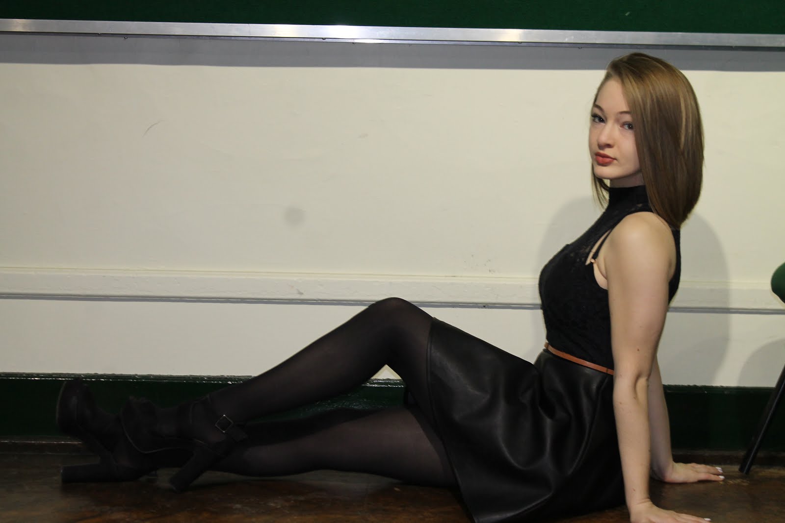
Here is my actor Holly:

Friday, 11 December 2015

Camera angles.

When taking my pictures i will be using a range of different camera angles, the main picture on my front cover will be a medium close up of Holly's face. A medium close up is when the camera is close to the face but not too close because the shoulders are still included in the shot. I have chose this because my style models mainly feature medium close up shots and i feel like a medium close up shot will show the make up that Holly will have on.

 Here are some examples of medium close up shots for my front cover:


For my contents page and double page spread i am planning to take a long shot of my actor. A long shot is where you can see the persons body i am doing this because this is also another shot that is often featured in my style models and i want my pictures to show the type of dress Holly will be wearing.

Here are some examples of long shots:

Tuesday, 8 December 2015

Props.

While thinking about all the aspects of Mise en scene i have decided that i will not be including any props in my pictures. I have decided to do this because i don't think adding any props will add anything that will further improve the way my pictures look. I also think props will make my pictures look too forced.
Here are some examples of pictures with no props included in them:

Friday, 4 December 2015

Costume for my pictures.

Costume:

For my pictures my actor Holly will be wearing a dress. I chose for holly to wear a dress because i want her to look smartly dressed and wearing this will create this look. The type of dress i want her to be wearing is a skater skirt style, these dresses are very girly and look good. Here is some examples of skater skirt dresses:


A skater dress popular thing to wear and is often included in the pop music magazine genre,which is what i am focusing my magazine on.


Tuesday, 1 December 2015

My actor for my pictures.

I have decided my actor to feature in my magazine pictures will be Holly Hulse. I have chose holly because she enjoys performing arts and loves to act so i feel like she will be the best person to have on my front cover, she will be able to create the exact pose and position that i need her to.

Here is what holly looks like:

I feel like Holly's image will fit in with my pop genre music magazine and she will be a good person to feature in my pictures.