Saturday, 30 April 2016

Double page spread creation

Like my front cover and contents page, for my double page spread i took out the background of my picture, so i could then added the light blue background to match the other pages.


Then i added the background colour.


Next i added the main title which was ' Holly Hulse' for the font and style of this i used the same as what i used with the masthead's on my previous pages. This meant i used the ' drop shadow ' affect and used the same colours. 


After that i added the quote from Holly saying "Don't underestimate me" in bold text for it to stand out next yo and again i added the ' drop shadow ' affect to this. 


Then i added all of my text. This was a question and answer interview. For the questions i used the colour black and added the ' drop shadow' and ' bevel and emboss ' affects. I done this to the questions so they would stand out more than the answers, so it was clear without reading that they was the questions.


For the answers i used the purple colour that i have used throughout. i added the ' drop shadow' affect to every answer that i included.


Lastly i added page numbers at the bottom of both pages. For them to stand out i used a purple box for them to go in.  For the numbers i used the ' drop shadow'  and ' bevel and emboss ' affects to make them bold and readable.


Here is my finished double page spread:


Contents page creation


Firstly i took the background out of my main image so i could then add a coloured background to match my front cover. Here is the picture before and after i took out the background.


Then i added the light blue coloured background, I think the blue really goes well with the black dress Holly is wearing. I then added the title of the magazine at the top of the page. I done this to keep it going from the front cover. I added the same affect as i did on the front cover, which was the 'drop shadow' affect, i also kept the same two colours. 


Next i added the text ' inside this mag ', for this text i added into a box to  make it stand out more and this is also something my style model does with some of their texts. 

              
To the box i added these affects to help it blend batter with the background.


Then i added a black box outline to add text to later on. To do this i used 4 line shapes and joined them together to make the box shape. I added the ' drop shadow' affect to these lines to help them to stand out.


After that i added the text inside the box. The text said what some of the pages included in this magazine. For the page numbers i added the ' stroke' affect to make them bolder than the text underneath.
        

I added more images next. I placed two more images of Holly on to my contents page. I done this because my style model add's more than one image to their contents page and i think this makes my contents page look more professional. I added the ' drop shadow ' and ' stroke ' affect to both images to help them stand out against the background and blends in well with the rest of the work. 


Lastly i added the contact information for twitter and Facebook at the bottom of the page. To do this i used the Facebook and twitter logo and then added the names next to them. I added the ' bevel and emboss ' affect to the logos to help them blend with the background. Here is my finished contents page.


Friday, 29 April 2016

Front cover creation

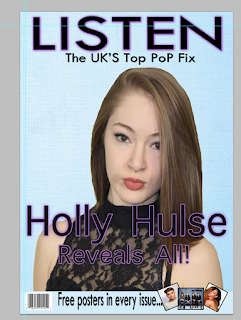
When i started my front cover the first thing i done when take the background out of my chosen main image. I done this so later on i can add a colour to the background of my front cover and have the image blend well with it. This is the image before and after i took the original background out. Now it was ready for me to put it onto my front cover.


I then chose the background of my front cover. I wanted a colour that stood out so i chose a light blue. I then added my background colour to start my front cover. Then i added my image on top of the background colour, i think this image blends well with the colour i chose.


Then i moved on to the title of my magazine. As i have previously said the title of my magazine will be 'listen'. My title will be placed at the top of the front cover so it can stand out and catch peoples eye. I chose the colour black for my title and added a purple glow around it.

To add affect to the title i added a 'drop shadow' from the blending options. Doing this changed it form plain black and added a purple glow around each letter.  Heres the plain black compared to it with the drop shadow and purple glow.


I then added my slogan which is ' The UK'S Top Pop Fix'. I added this under the title of my magazine in a smaller sized text. Then i added a drop shadow affect to make the text darker and bolder.


Next i added the main text of the front cover which was 'Holly Hulse Reveals all'. When i added the text i wanted it to be black like the title. However as you can see you can't see the black text doesn't show up against Holly's black dress. so to fix this i added the drop shadow, outer glow, inner glow blending options to it and it made the text stand out over the black dress. 


When adding the banner at the bottom of my magazine i added a shape and added colour.


I then added the text 'free posters in every issue...' then i added some of the posters that will be included in my magazine, lastly i added the barcode because i wanted it to be at the bottom of my magazine just like my style model.


Then to show what is going to be featured in the magazine i added lines so i could then text inside them. I done the lines the purple colour so it matches the rest of my colour scheme. Here is what the lines on their own looked like.


Then i added the text in between the lines. I had a main title for each but of text which was the artist names, then i added a little more detail underneath.


Lastly i added the price of the magazine. I placed this underneath the slogan so people can see it, i put a purple coloured shape around it to make it stand out.


Thursday, 21 April 2016

Assessing My Coursework


Here is my front cover compared to a level 3 front cover, i think these two have some things in common like they both have a banner going across the bottom. Also they both have slogans featured.